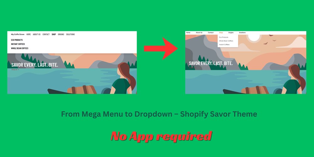
The Shopify Savor theme is modern and flexible, but by default, it uses a mega menu layout, which may not suit all types of stores.
If you prefer a lightweight, simple dropdown menu that looks clean and works perfectly on both desktop and mobile, this guide will show you how to do it step-by-step – no app or advanced coding required.
Why Use a Dropdown Instead of a Mega Menu?
Mega menus are great for stores with many product categories, but:
- They load extra content
- They can feel bulky in minimalist or small stores
- They aren’t always fully mobile-friendly
If your store has a limited number of categories, a clean dropdown menu makes navigation faster, simpler, and easier for your customers.
Step-by-Step: How to Convert Mega Menu to Dropdown in Shopify Savor Theme
To change the mega menu to a dropdown menu in the Shopify Savor theme, follow these 4 easy steps:
- Create a new snippet for the dropdown menu
- Edit the sections/header.liquid file and link the snippet to the header
- Add the CSS to your theme’s base.css
- Test on your store and adjust colors if needed
Files to edit:
- snippets/header-menu-dropdown.liquid (create a new snippet)
- sections/header.liquid
- assets/base.css
Before editing, you can duplicate your theme to keep a backup. You won’t need any coding expertise – just copy, paste, and save.
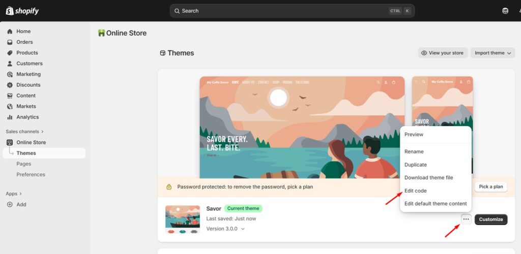
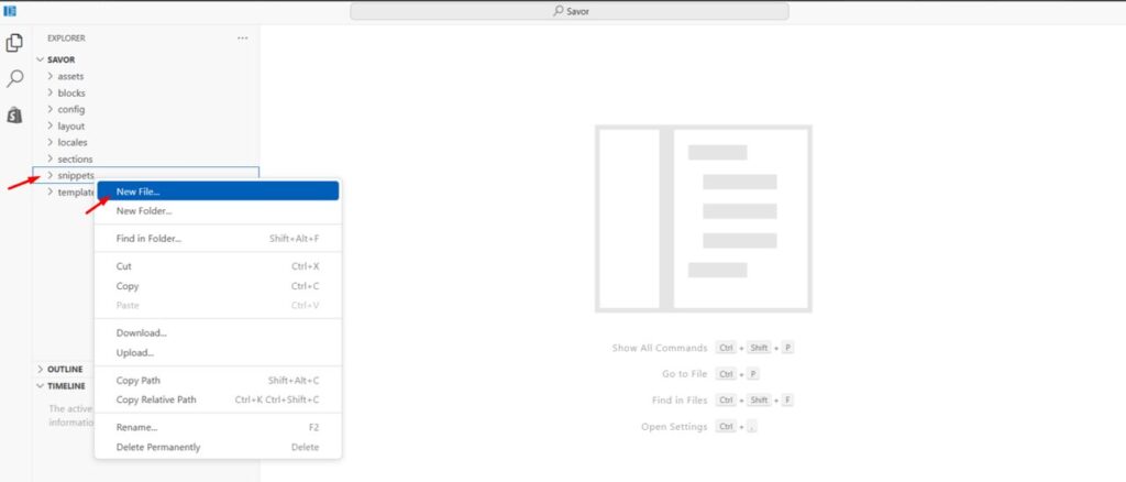
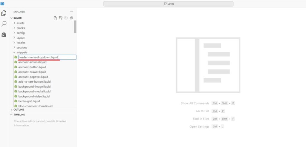
Step 1 – Create a New Snippet
- From your Shopify admin, go to –
Online Store → Themes → Edit Code - Under Snippets, add a new file (right-click → Add new).
Name this file header-menu-dropdown.liquid.
Now, copy the code below and paste it inside the new file, then save it:
<nav class="custom-header-nav" aria-label="Main navigation">
  <ul class="custom-header-menu">
    {% for item in menu.links %}
      <li class="custom-header-item {% if item.links.size > 0 %}has-children{% endif %}">
        <a href="{{ item.url }}" class="custom-header-link">{{ item.title }}</a>
        {% if item.links.size > 0 %}
          <ul class="custom-submenu" aria-hidden="true">
            {% for sub in item.links %}
              <li class="custom-submenu-item">
                <a href="{{ sub.url }}" class="custom-submenu-link">{{ sub.title }}</a>
              </li>
            {% endfor %}
          </ul>
        {% endif %}
      </li>
    {% endfor %}
  </ul>
</nav>
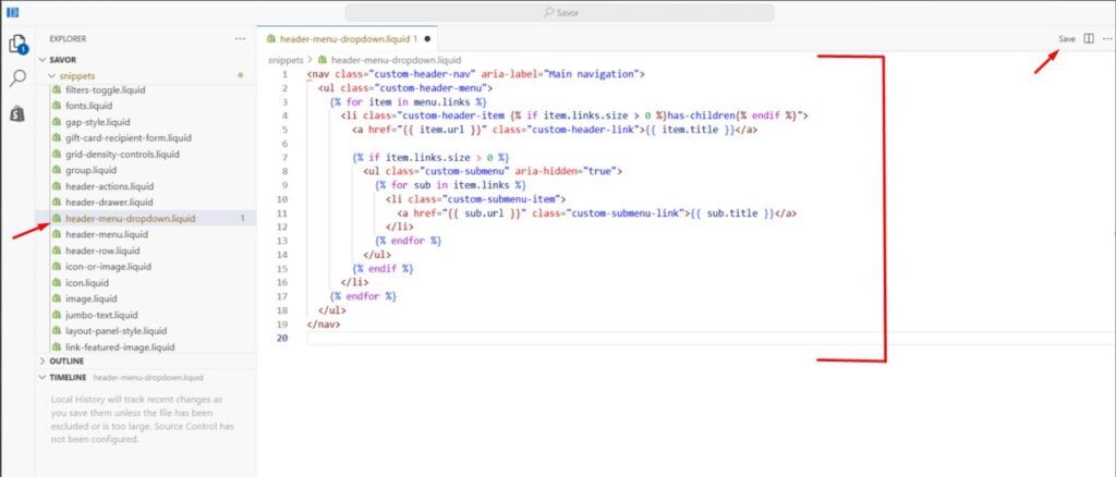
This snippet creates a simple hover-based dropdown menu that dynamically loads your navigation links.
Step 2 – Edit the File sections/header.liquid
- Open sections/header.liquid
- Remove all the existing code in this file.
- Paste the following code and click Save:
{% assign main_menu = linklists['main-menu'] %}
<nav class="header-navigation" style="position: relative; z-index: 9999;">
  <ul class="header-menu">
    {% for item in main_menu.links %}
      <li class="header-menu-item {% if item.links.size > 0 %}has-children{% endif %}">
        <a href="{{ item.url }}" class="header-menu-link">{{ item.title }}</a>
        {% if item.links.size > 0 %}
          <ul class="header-submenu">
            {% for sub in item.links %}
              <li class="header-submenu-item">
                <a href="{{ sub.url }}" class="header-submenu-link">{{ sub.title }}</a>
              </li>
            {% endfor %}
          </ul>
        {% endif %}
      </li>
    {% endfor %}
  </ul>
</nav>
<style>
  .header-navigation {
    position: relative;
    z-index: 9999;
  }

  .header-menu {
    list-style: none;
    display: flex;
    gap: 25px;
    padding: 0;
    margin: 0;
  }

  .header-menu-item {
    position: relative;
  }

.header-menu-link {
  text-decoration: none;
  color: #222;
  padding: 10px 15px;
  display: block;
  font-weight: 600;
}

.header-menu-link:hover {
  color: #c17b2a;
}
  .header-submenu {
    display: none;
    position: absolute;
    top: 100%;
    left: 0;
    background: white;
    list-style: none;
    padding: 8px 0;
    margin: 0;
    min-width: 200px;
    box-shadow: 0 4px 10px rgba(0, 0, 0, 0.15);
    z-index: 9999;
  }

  .header-submenu-item a {
    display: block;
    padding: 8px 15px;
    color: #333;
    text-decoration: none;
  }

  .header-submenu-item a:hover {
    background: #f5f5f5;
  }

  .header-menu-item:hover > .header-submenu {
    display: block;
  }

  .site-header,
  .header-wrapper {
    overflow: visible !important;
  }
</style>
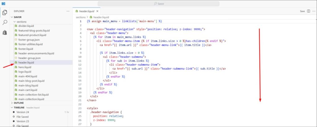
This links your main menu and renders the dropdown in your header.
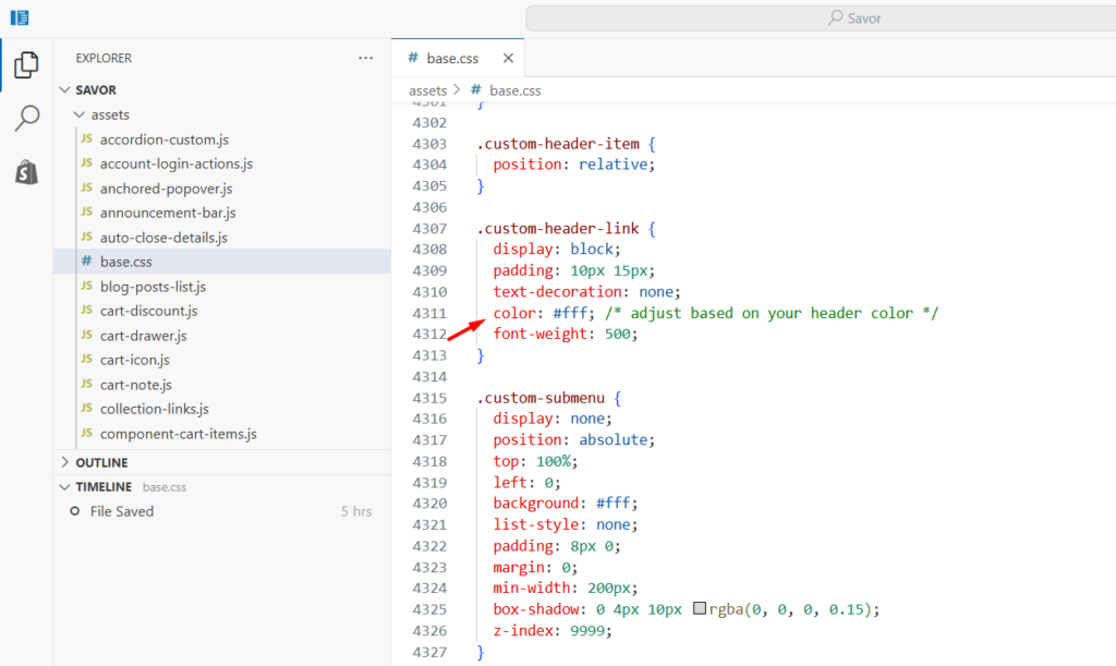
Step 3 – Add the CSS
Open assets/base.css (or your theme’s main stylesheet) and add the following code at the bottom and save it :
/* ==== Added extra css for dropdown menu - Savor Theme ==== */
.custom-header-nav {
  position: relative;
  z-index: 9999;
}

.custom-header-menu {
  display: flex;
  gap: 25px;
  list-style: none;
  padding: 0;
  margin: 0;
}

.custom-header-item {
  position: relative;
}

.custom-header-link {
  display: block;
  padding: 10px 15px;
  text-decoration: none;
  color: #fff; /* Adjust based on your header color */
  font-weight: 500;
}

.custom-submenu {
  display: none;
  position: absolute;
  top: 100%;
  left: 0;
  background: #fff;
  list-style: none;
  padding: 8px 0;
  margin: 0;
  min-width: 200px;
  box-shadow: 0 4px 10px rgba(0, 0, 0, 0.15);
  z-index: 9999;
}

.custom-submenu-item a {
  display: block;
  padding: 8px 15px;
  color: #333;
  text-decoration: none;
}

.custom-submenu-item a:hover {
  background: #f5f5f5;
}

.custom-header-item:hover > .custom-submenu {
  display: block;
}

.site-header,
.header-wrapper {
  overflow: visible !important;
}
This CSS ensures your menu is horizontal, the dropdowns open smoothly on hover, and they remain visible above banners or sliders.
Step 4 – Test and Adjust
Preview your store and hover over the main menu items.
If the dropdowns appear correctly, you’re done!
If your links are invisible (for example, white text on a white background), simply change the color value in .custom-header-link inside base.css to match your store’s color scheme.
You can also tweak background colors or padding if needed to match your design.
Result
After applying these steps, your Shopify Savor theme will display a clean and responsive dropdown navigation. The mega menu will be replaced with a simpler, faster-loading dropdown menu that fits perfectly on both desktop and mobile screens.
This new setup keeps your header area tidy, ensures dropdowns appear only where submenus exist, and gives your visitors a smooth browsing experience.
Conclusion
You don’t need third-party apps or complex coding to enhance your Shopify store’s navigation.
By adding just one new snippet and a few lines of CSS, you can transform the default mega menu into a professional dropdown menu in the Savor theme.
It’s lightweight, mobile-friendly, and designed for better usability – ideal for small brands, boutique stores, or anyone who values simplicity and speed in their Shopify design.
For Horizon theme users, you can read our detailed tutorial on converting its mega menu to a dropdown menu here


Well written and easy to follow even for non-technical readers.
I’m often to blogging and i really appreciate your content. The article has actually peaks my interest. I’m going to bookmark your web site and maintain checking for brand spanking new information.