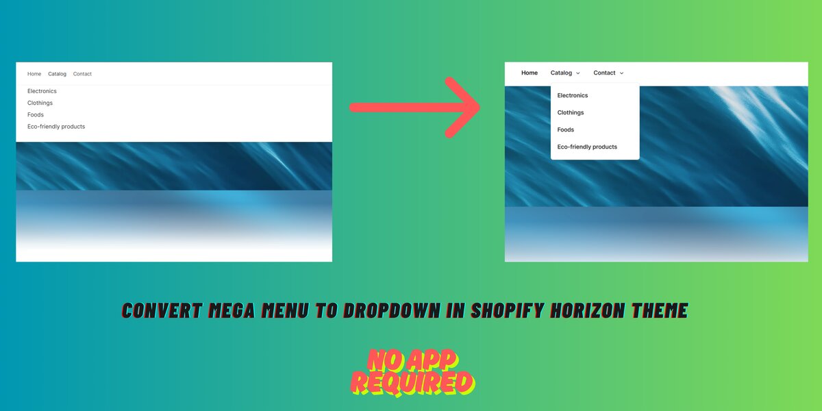
The Shopify Horizon theme is beautiful and AI-powered, but by default, it uses a mega menu layout, which may not always fit your store’s needs.
If you’re looking for a simpler, lightweight dropdown menu that works well on both desktop and mobile, you’re in the right place!
In this tutorial, I’ll show you how to convert Mega Menu to Dropdown in Shopify Horizon theme without using any third-party app or advanced coding.
Why Use a Dropdown Instead of a Mega Menu?
Mega menus are great for large stores, but:
- They load extra content
- Can feel too bulky on minimalist stores
- Aren’t always mobile-friendly
If you run a small-to-medium store, a clean dropdown menu can give your navigation a faster and more focused look.
Step-by-Step: How to Convert Mega Menu to Dropdown in Shopify Horizon Theme
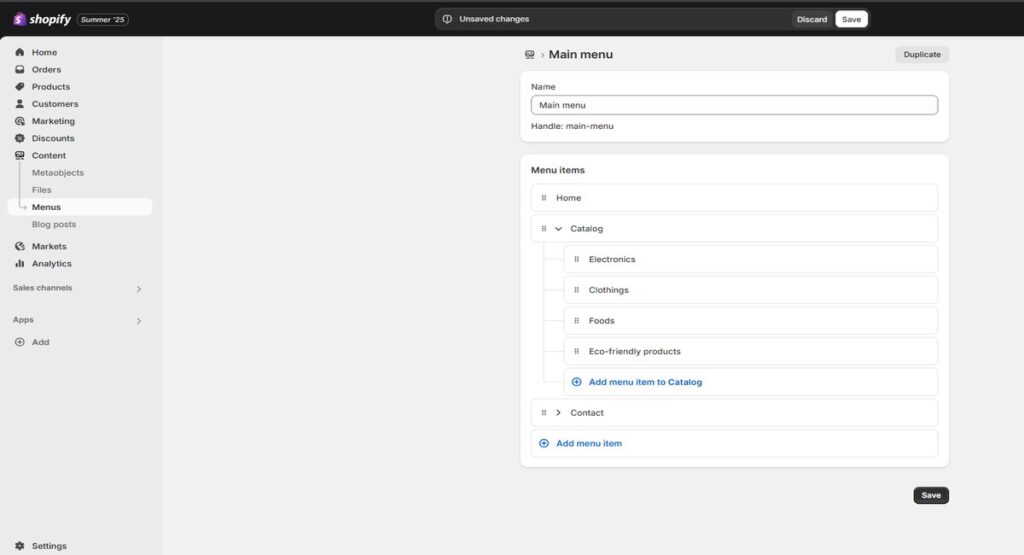
From the Shopify admin > menus, the Menu Items are added like the screenshot below. Under the menu item ‘Catalog’, four sub-menu items (Electronics, Clothes, Foods, Eco-friendly Products) are added, which we want to show in the dropdown menu. But by default, it shows the mega menu in Shopify Horizon theme.
Now, to create a dropdown menu in Horizon theme, just follow the below two steps-
- Create a New Snippet
- Link the Snippet to the Header
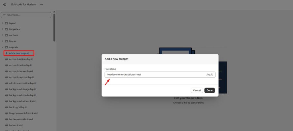
1. Create a New Snippet
- Login to your Shopify admin
- Online Store → Themes → Edit code
- Under Snippets, click “Add a new snippet”
- Provide a name and save it
Let’s say it is named as header-menu-dropdown-test.liquid
Now paste the below code in header-menu-dropdown-test.liquid file and save it.
{% liquid
assign navItems = block.settings.menu
%}

<div class="custom-header-nav mobile:hidden">
  <nav class="nav-container">
    <ul class="nav-container__menu list-unstyled">
      {% for item in navItems.links %}
        <li class="nav-container__item">
          <a href="{{ item.url }}" class="nav-link{% if item.active %} nav-link--current{% endif %}">
            {{ item.title }}
            {% if item.links.size > 0 %}
              <span class="dropdown-toggle-icon">
                <svg width="13" height="13" viewBox="0 0 14 14" xmlns="http://www.w3.org/2000/svg" fill="none">
                  <path d="M3 5l4 4 4-4" stroke="currentColor" stroke-width="1.5" stroke-linecap="round" stroke-linejoin="round"/>
                </svg>
              </span>
            {% endif %}
          </a>

          {% if item.links.size > 0 %}
            <div class="dropdown-panel">
              <ul class="dropdown-panel__menu">
                {% for subitem in item.links %}
                  <li>
                    <a href="{{ subitem.url }}" class="dropdown-link{% if subitem.active %} dropdown-link--current{% endif %}">
                      {{ subitem.title }}
                    </a>
                  </li>
                {% endfor %}
              </ul>
            </div>
          {% endif %}
        </li>
      {% endfor %}
    </ul>
  </nav>
</div>

{% stylesheet %}
.nav-container__menu {
  display: flex;
  gap: 2rem;
  font-weight: 600;
  list-style: none;
  margin: 0;
  padding: 0;
}

.nav-container__item {
  position: relative;
  list-style: none;
}

.nav-link {
  text-decoration: none;
  color: var(--color-foreground);
  padding: 8px 0;
  display: inline-block;
}

.nav-link--current {
  font-weight: bold;
}

.dropdown-toggle-icon {
  margin-left: 6px;
  display: inline-block;
  vertical-align: middle;
  width: 12px;
  height: 12px;
}

.dropdown-panel {
  position: absolute;
  top: calc(100% + 5px);
  left: 0;
  min-width: 220px;
  background: var(--color-background);
  border-radius: 6px;
  border: 1px solid rgba(0,0,0,0.08);
  box-shadow: 0 8px 12px rgba(0, 0, 0, 0.1);
  opacity: 0;
  visibility: hidden;
  transform: translateY(10px);
  transition: all 0.25s ease-in-out;
  z-index: 10;
}

.nav-container__item:hover .dropdown-panel {
  opacity: 1;
  visibility: visible;
  transform: translateY(0);
}

.dropdown-panel__menu {
  padding: 10px 0;
  margin: 0;
  list-style: none;
}

.dropdown-panel__menu li {
  list-style: none;
  margin: 0;
  padding: 0;
}

.dropdown-link {
  display: block;
  padding: 10px 16px;
  color: var(--color-foreground);
  text-decoration: none;
  transition: background 0.2s ease;
}

.dropdown-link:hover {
  background: var(--color-background-hover);
}

.dropdown-link--current {
  font-weight: 700;
}
{% endstylesheet %}
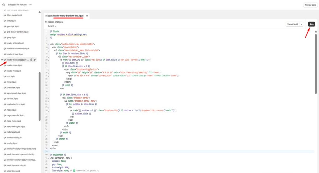
This code loops through your menu and displays a dropdown only when sub-menus are present. It’s lightweight, clean, and mobile-friendly.
2. Link the Snippet to the Header
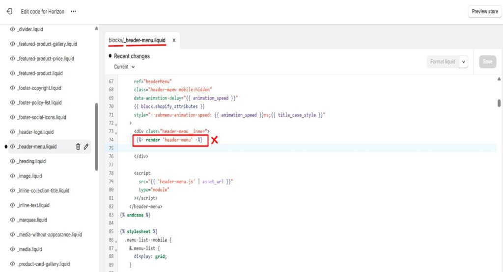
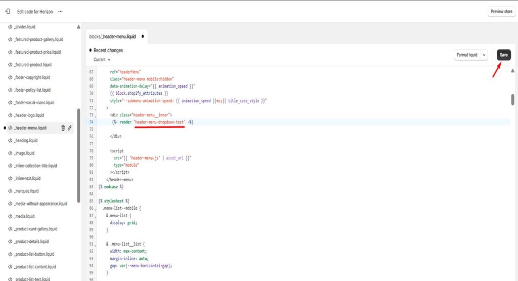
Now go to blocks/_header-menu.liquid and find the part where the mega menu is being rendered and replace it with your newly created snippet.
Puzzled? Follow the steps below –
- find {%- render ‘header-menu’ %} in sections/blocks/_header-menu.liquid
- replace it with {%- render ‘header-menu-dropdown-test’ -%}
- and save it.
Final Output
Your header menu will now:
- Show a clean horizontal navigation bar
- Display dropdowns only for items with sub-menus
- Remove unnecessary bullets and styling clutter
- Work perfectly on desktop and resize well for mobile
Conclusion
You don’t need heavy code or apps to make your Shopify menu look better.
With this simple snippet, you can replace the default mega menu with a clean dropdown menu in the Shopify Horizon theme.It’s easier for users, better for mobile, and feels faster.
Perfect for small brands, niche stores, and anyone who loves simplicity.


very informative articles or reviews at this time.
This is my first time pay a quick visit at here and i am really happy to read everthing at one place
Hi there i use savor theme on shopify and been tried different method to have exactly change vertical mega menu drop down but nothing change, is there anything i miss
Hi Anh, thanks for your comment,
here is How to Convert Mega Menu to Dropdown in Shopify Savor Theme (No App Needed)